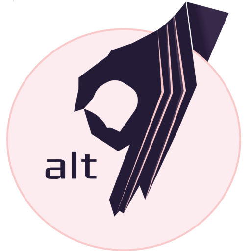
Our logo was designed to be the face of our brand.
The symbol you see reflects the values of our brand.
Of course, normally logo stories are told in this way. However, we didn’t create our logo like this. It is true that we made a lot of effort to avoid clichés. We truly love our logo and we want to share its story with you.

Our logo’s meaning is often questioned and tends to confuse people. While it may be seen as having a gender-biased approach according to Turkish values, in most parts of the world, it actually represents “everything is okay” or “everything is fine.” It also carries meanings such as “perfect,” “okay,” or “flawless” in many cultures. We also know that it is a widely used symbol among divers. The message we want to convey here is quite significant: everything is okay with alt-9!
The circle formed by the hand in our logo is one of the oldest symbols in human history, dating back to ancient times. As we know, the circle symbol has a significant presence in mythology and science, and it undeniably holds multiple meanings linguistically.
In the 1960s, astronauts used a hand gesture that symbolized everything being okay, and we incorporated this five-fingered gesture into our logo to represent our team’s five members. Despite our differences in hobbies, music preferences, areas of expertise, and many other aspects, when we come together, we harmonize and complement each other in every field and topic that matters.
“Like the fingers of a hand; different from each other, yet completing, strengthening, and achieving together.”
Moreover, when looking at our name, we come across a rather cute detail. If you press the Alt and 9 keys simultaneously on your Windows operating system computers, you see the “○” symbol. This symbol we see is also a reference to the hand in our logo.
“The limit of what we can achieve is like reaching the corner of a circle.”
Now, how did the design process unfold?
As a team, we felt the pressure to decide on our logo, and it was a busy day for all of us. Instead of sitting down, thinking, collecting alternatives, and working on them, everyone started sharing their ideas freely.
The common point among our ideas was that they needed to be related to digital aspects. We realized how often we use shortcuts on the computer while working. While discussing the key combinations we use, even those ingrained in our memory, to facilitate our work, we wanted to try different alternatives. We pressed various keys, and the option that resonated with us the most was “alt-9.”
Then, as we pondered how we could represent the circle symbol, which we strongly associated with ourselves, in our name, the “okay” gesture came to mind. We immediately opened a design program and started drawing. And that’s how the hand-drawn design, which became the logo of alt-9, came to life.
This logo, which encompasses our team, our work, and our creativity, was created by our own hands as a way to express ourselves.